Solar Panels in Cambridge
Solar panels in Cambridge
Solar PV in Cambridge
Cambridge Solar has installed a large number of solar panel systems in Cambridge and the surrounding area. But how good is Cambridgeshire as an area for installing solar panels?
We have been monitoring a number of systems for more than 12 months and so have some interesting data that we can share with you.
We have also carried out some calculations on how Cambridge compares with other areas in the UK and Europe in terms of electricity production from solar panel systems.
Using available data we also show what you should expect in terms of seasonal variation and daily variation from your solar pv system.
Also included in this section is a map of solar radiation in the UK and then a list of the important factors that affect the performance of the system with some supporting data.
Solar panels in Cambridge vs. The UK How does Cambridge compare with other UK locations for installing solar panels? We have done some calculations for different systems installed throughout the UK to give you an idea. Considering the UK’s size there is not a huge difference between the points, however a system in Cambridge will generate 12% more than one in the north of Scotland and 12% less than on at Land’s End!!!
Solar panels in Cambridge vs. The UK
How does Cambridge compare with other UK locations for installing solar panels? We have done some calculations for different systems installed throughout the UK to give you an idea. Considering the UK’s size there is not a huge difference between the points, however a system in Cambridge will generate 12% more than one in the north of Scotland and 12% less than on at Land’s End!!!
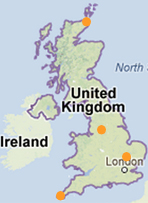
Solar panels in Cambridge vs other UK locations
| MWh per year | 2 kWp | 4 kWp | 10 kWp |
| Cambridge | 1.7 | 3.5 | 8.7 |
| John o'Groats | 1.5 | 3.0 | 7.5 |
| (Scotland) | -12% | -14% | -14% |
| Glasgow | 1.6 | 3.1 | 7.8 |
| -6% | -11% | -10% | |
| Manchester | 1.7 | 3.3 | 8.3 |
| 0% | -6% | -5% | |
| Land's End | 1.9 | 3.8 | 9.6 |
| (Cornwall) | +12% | +9% | +10% |
The above table assumes that the solar panel systems are facing south, are pitched at 35 degrees and that’ none of the solar panels are suffering from any shading issues. Your location can also be effected by the local landscape. Compare an the horizon of a location in the Fens to one in mid wales.
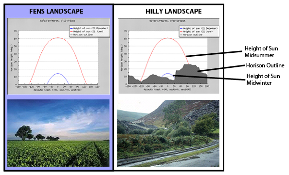
The village in mid-Wales hardly sees the sun in the middle of winter! And misses a lot of the afternoon and evening sunlight for the remainder of the year. Whereas the location in the Fens has no problems at all with landscape shading a possible solar panel installation.
Solar Panels in Cambridge vs. Europe
How does Cambridge compare with other locations in Europe for installing solar panels? Again we have done some calculations to give you an idea of the possible yield from solar panel installations around Europe and how they compare with a solar panel installation in Cambridge.
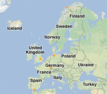
| MWh per year | 2 kWp | 4 kWp | 10 kWp |
| Cambridge | 1.7 | 3.5 | 8.7 |
| Tromso | 1.4 | 2.8 | 6.9 |
| (Northern Norway) | -18% | -20% | -21% |
| Hamberg | 1.7 | 3.4 | 8.4 |
| (Northern Germany) | 0% | -3% | -3% |
| Freiberg* | 1.9 | 3.8 | 9.4 |
| (Southern Germany) | +12% | +9% | +8% |
| Costa Del Sol | 2.7 | 5.5 | 13.6 |
| (Sunny Spain) | +59% | +57% | +56% |
The above table assumes that the solar panel systems are facing south, are pitched at 35 degrees and that’ none of the solar panels are suffering from any shading issues.
*Freiburg is a town in Germany which until recently had more solar panels installed that the whole of the UK! As you can see from the charts above there is not a huge difference between the amount of solar energy available in the UK and Germany. Germany has a total installed capacity of around 30 GWp whereas the UK has around 1.5 GWp installed. At our current rates of installation in will take us over 100 years to catch up! Read more about Freiburg.
Solar Panel Seasonal Variation
As you might expect solar panels are a lot more productive in the summer months than in the winter months. Not only are the days longer but the sun is stronger and the weather tends to be better! All of this results in the summer months having a much higher yield than the winter months.
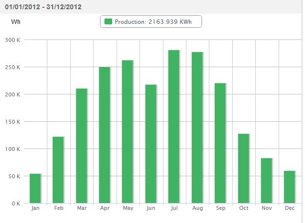
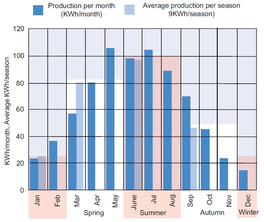
Annual variation The below chart is data that has been taken from a Cambridge Solar installation installed locally in a village just north of Cambridge. The data is from 2012 and it shows clearly how the system performs over the year. The system went down for a few days in June which is why it is a poor month, but apart from that the annual cycle is pretty clear. You might expect to make around 5 times more energy in a summer month than in a winter month.
The below chart has been taken from the official UK ‘Guide to the installation of PV systems’ published by the MCS. It again illustrates quite clearly the seasonal variation in the energy production of solar panels. I do not believe that this is based on a specific solar panel installation but is based on generic data on how solar panel systems are expected to perform.
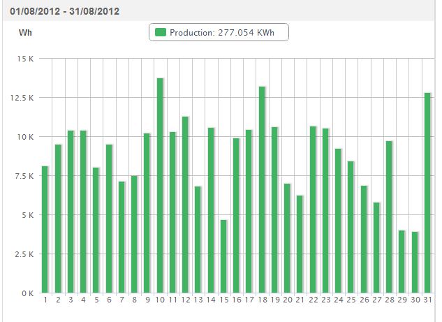
Monthly Variation The below graph illustrated the same system as Chart 1. Above. This time we are looking at the variation in solar power production over a month, August 2012. You can see that there are quite significant differences between ‘good’ days and ‘bad’ days. But as you might expect there is a definite average which is very slightly decreasing as the month goes on. You would see a similar pattern in most months.
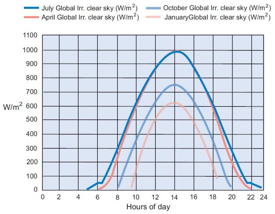
A topic that is worth being familiar with if you are planning to, or are have already installed a solar panel installation is the daily variation of the system. If you are familiar with this and your electricity consumption this you can make better use of your solar pv system by switching on and off electrical devices when you have free solar electricity available, or not. The below chart has been taken from the official UK ‘Guide to the installation of PV systems’ published by the MCS. It illustrates the daily variation and compares different times of the year. However this is based on clear skies so although is interesting it does not tell the whole story. I don’t think that this is based on a specific solar panel installation but is based on generic data on how solar panel systems are expected to perform.
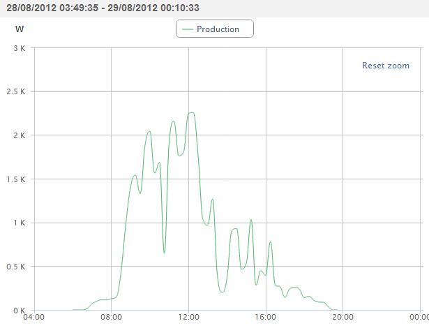
The below chart is taken from data monitoring readings of a Cambridge Solar installation that was installed near Cambridge in 2011. It is a single day in August 2012. You can see the system switching on before 8am, it was a nice morning but then at around 10.30am there was some significant shading, more than likely cloud passing. The afternoon was less pleasant and was probably overcast with the thickness of the cloud dictating the amount of electricity generated by the solar panels. However the system continues to generate electricity till just before 8pm when it shuts down. ..understandable after 12+ hours work, day-in, day-out!
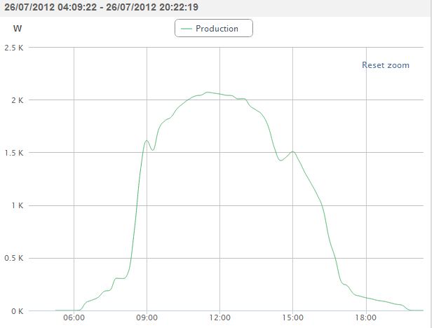
The next chart illustrates the production of a solar panel system on almost completely clear day. A couple of clouds pass over just after 9am and just before 3pm but apart from that it is a perfect shape. This is from the end of July and the solar panels switch on at around 6am and don’t switch off till around 8pm. Unless the property has some large electricity usages the vast majority of this electricity will be exported to the grid. The last chart in this series goes into this in some more detail.
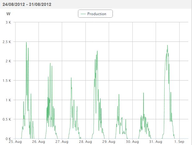
This next chart simply displays the daily production of the same solar panel system over a week at the end of August 2012. This can be seen in more detail in the YouTube video below.
The system was designed using a Solar Edge inverter with power optimisers on every solar panel. This means that we can actually monitor exactly how each panel is performing. Take a look at the YouTube video below. It shows a week’s worth of data displayed over about 30 seconds. If you pause when it’s ‘daylight’ you can see how each individual solar panel is performing. Feel free to leave comments below the video and subscribe to our channel.
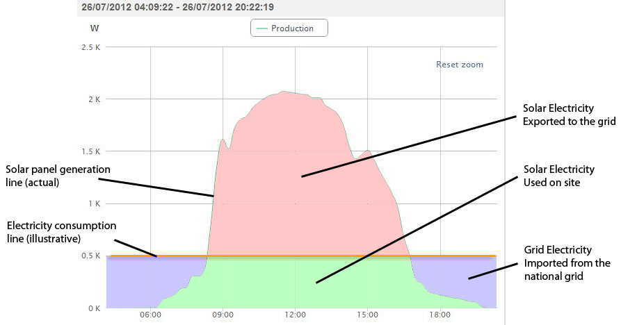
This last chart illustrates how energy is used, exported and imported with a solar pv system. The green line shows the production of the solar panels over the day, starting at around 6am, hitting a peak at around midday and then reducing until they stop generating at around 7.30pm. This data is from one of our systems installed in Cambridge. The orange line is illustrative only; it is not based on any data monitoring but it a reasonable estimate of the average consumption of a domestic property. Of course in reality much less electricity would be being consumed at night and there would be big spikes during the day when electrical appliances are switched on.
At night the solar pv system does not generate any electricity at all. Any electricity consumed in the property has to be imported from the national grid. This is illustrated by the Blue area.
During the day the solar panel system will be generating electricity. The property will use this solar electricity before it will try and import any grid electricity. This solar electricity generated and used on site is illustrated by the Green area.
When the solar panel system is generating more electricity than the property needs and excess is exported to the national grid. This will be used by other properties in the vicinity who will be paying their electricity supplier their standard tariff to use it! This exported solar electricity is illustrated by the Red area in the graph below.
Any questions please get in touch with Cambridge Solar on 01223 863 885 or visit our Contact Form.
